Saturday, 26 May 2012

mounting images

 my images looked better floating off the wall as it gave them a better presence. I measured them at 67 inches from the ground to the top of each image with a 1 foot distance inbetween them
4 nches down from the top of the image was where i marked the top of the first baton. the sides were apinted white so they blended with the wall.
I stuck velcro too it in order to attached the images as the aluminium was really light weight
The Velcro was secured with staples


The other side of the Velcro was stuck onto the Velcro strips already on the wall and the stick backing removed.
Using a long piece of wood and a spirit level i marked up where the tops of the images would go so they would be level with each other. With them being on Velcro it was easy to straighten them


This is how the images looked once they were all up. the 2 center ones were placed in this way as a means of drawing the viewer in but without two much emphasis on them making a more convincing "pair" of eyes

A clean projection

 As the ceiling was dirty, the projection didnt show up as clearly as i would've
liked. There was discussion how to prepare the ceiling for the projection, as i wanted the bars on the ceiling involved in my work as a means of intervention, i didnt want to cover them up with paper or cloth. Using some means of projection screen, wouldve have worked anyway as the ceiling was bowed, so the screen wouldnt have been tight enough to clean a crisp image
Painting it would also has covered the bars to some extent and, should i have done that, i would've had to paint the entirety of the ceiling which was impossible without scaffolding. So it was decided that i clean it. The projection was set up to where it needed to be and marked off with masking tape. Using a bucket of warm water and a washing up scourer, i was able to clean the ceiling using ladders. This image shows the masked off area with one section done

 second section
 third section. At the top of this image you can see the projected image and it become evident how dull the projection is on the ceiling in its pre-cleaned state
 This shows the projection in its desired space, showing more clearly how better it looks on a cleaned surface
 Surface fully cleaned
 The masking tape was removed and then i had to perfect the angle of the image
 This was done by screwing the projector down, tightening and loosening the screws to balance out the angle
Screwing down the projector was also done for sercurity reasons

In this image you can see an additional block added to the angled shelf. This was done as i couldn't get my software to correct the angle of the footage and the key stone option on the projectors menu only flipped vertically and horizontally. So by using additional wood, the footage was straightened to fit the area

This image shows the final projection place
Image of the projection box in the state it will appear at exhibition. The projector on top as been secured, The box has been bolted to the floor and the cables have been secured to the wall
 Finished wall. The top (where the paint buckets are) is removable to access the plug sockets. This top section is supported by 2 batons secured to the wall
This wall was sanded and filled, sanded again and had 2 coats of white emulsion
The wall was built first so the one projection could be lined up with the corner of it. this way the box could be placed in a suitable spot to project and i could then go on to work out the angle needed for the other projector.


 The projection box at this stage was simply a box. i had yet to angle the projectors to their required places, the box needed shelves to house the equipment an dthe box in it entirety needed a proper placement and pinting.


Once id worked out where the projections needed to be i then worked out how to get them to fit inside the projection box and keep the same angle
The box was pushed towards the back and the one proctor needed to be on top of the box to angle upwards onto the ceiling. the second projector had to be close the ground and angled down slightly. So i needed a definite shelf for this
I had to work this out first so i could make sure the box would be in the best vantage point to project both films out of the same box

 This is the ceiling projection on a white wall. demonstrating how the angle of the footage doesn't look right being on a flat wall, hence the need of the sloping ceiling in the space.


 Once the angle had been worked out for the top projector, an angled shelf was built so the projection could be anled at the ceiling. a door was added with a lock and holes to keep the internal projector cool


 Side view. Shows the hole in the top for the cables from the projector to go through to the plus and corresponding dvd player
The second hole in the bottom is for the 2nd projector

 Inside view showing the shelves and where the equipment will be placed.
The dvd player and projector shown are linked together. The top shelf will be for the dvd player that will be connected to the projector on top of the box


A view of the finished box once it had been painted

Wall and projection box build and projection line up

 Finished wall. The top (where the paint buckets are) is removable to access the plug sockets. This top section is supported by 2 batons secured to the wall
This wall was sanded and filled, sanded again and had 2 coats of white emulsion
The wall was built first so the one projection could be lined up with the corner of it. this way the box could be placed in a suitable spot to project and i could then go on to work out the angle needed for the other projector.


 The projection box at this stage was simply a box. i had yet to angle the projectors to their required places, the box needed shelves to house the equipment an dthe box in it entirety needed a proper placement and pinting.


Once id worked out where the projections needed to be i then worked out how to get them to fit inside the projection box and keep the same angle
The box was pushed towards the back and the one proctor needed to be on top of the box to angle upwards onto the ceiling. the second projector had to be close the ground and angled down slightly. So i needed a definite shelf for this
I had to work this out first so i could make sure the box would be in the best vantage point to project both films out of the same box
 This is the ceiling projection on a white wall. demonstrating how the angle of the footage doesn't look right being on a flat wall, hence the need of the sloping ceiling in the space.

 Once the angle had been worked out for the top projector, an angled shelf was built so the projection could be anled at the ceiling. a door was added with a lock and holes to keep the internal projector cool


 Side view. Shows the hole in the top for the cables from the projector to go through to the plus and corresponding dvd player
The second hole in the bottom is for the 2nd projector
 Inside view showing the shelves and where the equipment will be placed.
The dvd player and projector shown are linked together. The top shelf will be for the dvd player that will be connected to the projector on top of the box


A view of the finished box once it had been painted

Monday, 14 May 2012

not using embedding

Decided the prints would look better on aluminum as it prints out the highlights of the images. So the dark areas of the reflection in the eye will be enhance and appear brighter.
As aluminum is shiny, i have opted for a matte laminated print
I think embedded it distracted away from the image, which is the key aspect to my work

testing mounting

I didnt want a frame or anything visible on the front of the image like pins to hang the photos.
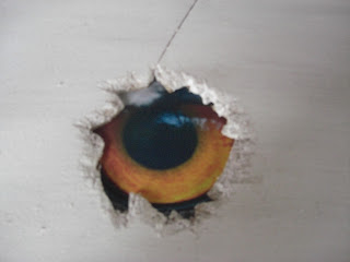
Mount board can look tacky so im trying embedding the images into the wall before i look at other methods. I think this method where it make the image part of the fabrication of the building, reflects onto how animals have adapted to have humans have changed the world

tried experimenting with each image and the shape of the hole. this one was cut into to make a basic ragged shape, and then chiseled down to make it appear as though the hole had been ripped out.
Each of the boards was painted white to replicate the gallery wall.
This board was Chip board


 Ragged shape without chiselling. chipboard. dont like this looks too deliberate
 This is a circle hole on chip board. image was too small to make same effect as the other 2. it was also found the images look better if they are a few cms behind the surface of the board. So be better if they were mounted. Maybe in a picture frame and using that seperate the image from the board so the picture frame is sandwiched


 Experimented moving the image further back to see how thick a frame i would need if i used this idea.
this is too far back. chipboard
 This time the image was further forward but this time using MDF. the paint doesnt take well to MDF. better on chip board

Just experimented with a ragged shape on the mdf to see what it looked like


The first image combined with shape that been chiseled down on chipboard works the best

After id confirmed this, i tested the arrangement (how many prints and how they should be hung) in my sketchbook through ripping the paper
Decided that one image per board in a triptych style look better

Final Prints

 This one i think turned out the best as all the feathers around the eye are sharp aswel as the reflection
 I have chosen not to use this one as the color appears dull despite the reflection being clear


This one im not sure about as isnt as high a quality as the others but ill print it anyway to see